Logo
Rhode Island News Collaborative
A modern mark rooted in place, designed to reflect unity, growth, and collaboration.
Project & Company Details
Rhode Island News Collaborative is an organization centered around connection, shared learning, and community-driven progress across the state. While their mission is rooted in unity and impact, their previous logo didn’t reflect those values clearly. I was tasked with redesigning their visual identity to better express their collaborative spirit and geographic focus. The resulting logo combines simplicity with symbolism, aligning their brand with their mission more authentically.
Process and Immersion
I began by exploring the organization’s purpose, goals, and community presence. A key insight emerged: their work is all about people coming together. I also looked at existing visual cues tied to Rhode Island and regional nonprofits, studying how geography and community are typically represented in identity systems. This immersion helped clarify that the new mark needed to feel both rooted in place and conceptually expansive.
Design Approach
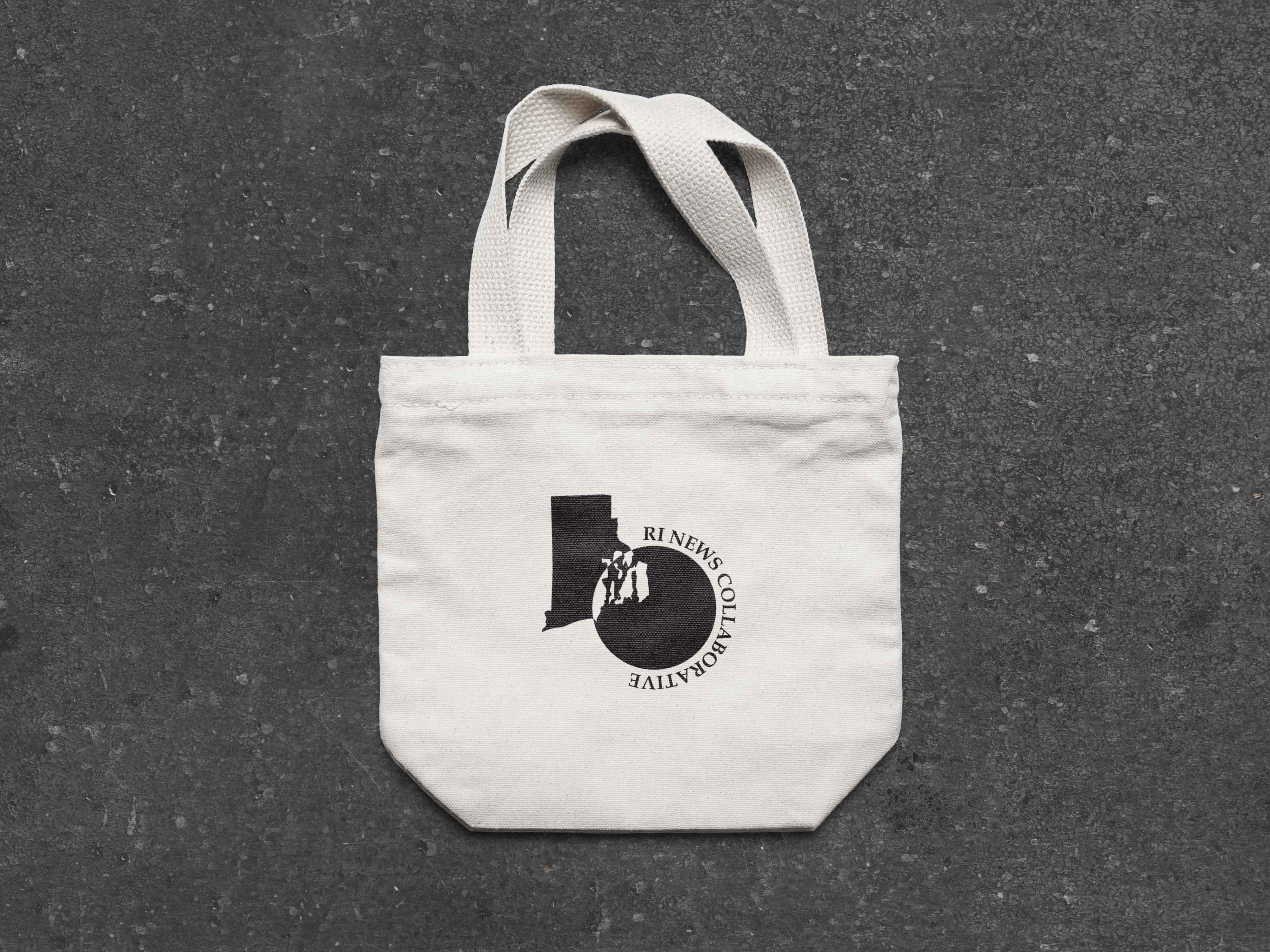
The core idea of the redesign was to merge place and connection into a single, unified form. I stacked simplified vectors of the state of Rhode Island and played with the outlines to create a visual structured depth and rootedness. I placed a circle, a universal symbol of unity, community, and shared purpose. Together, these elements create a sense of cohesion, showing the collaborative efforts that define the organization.
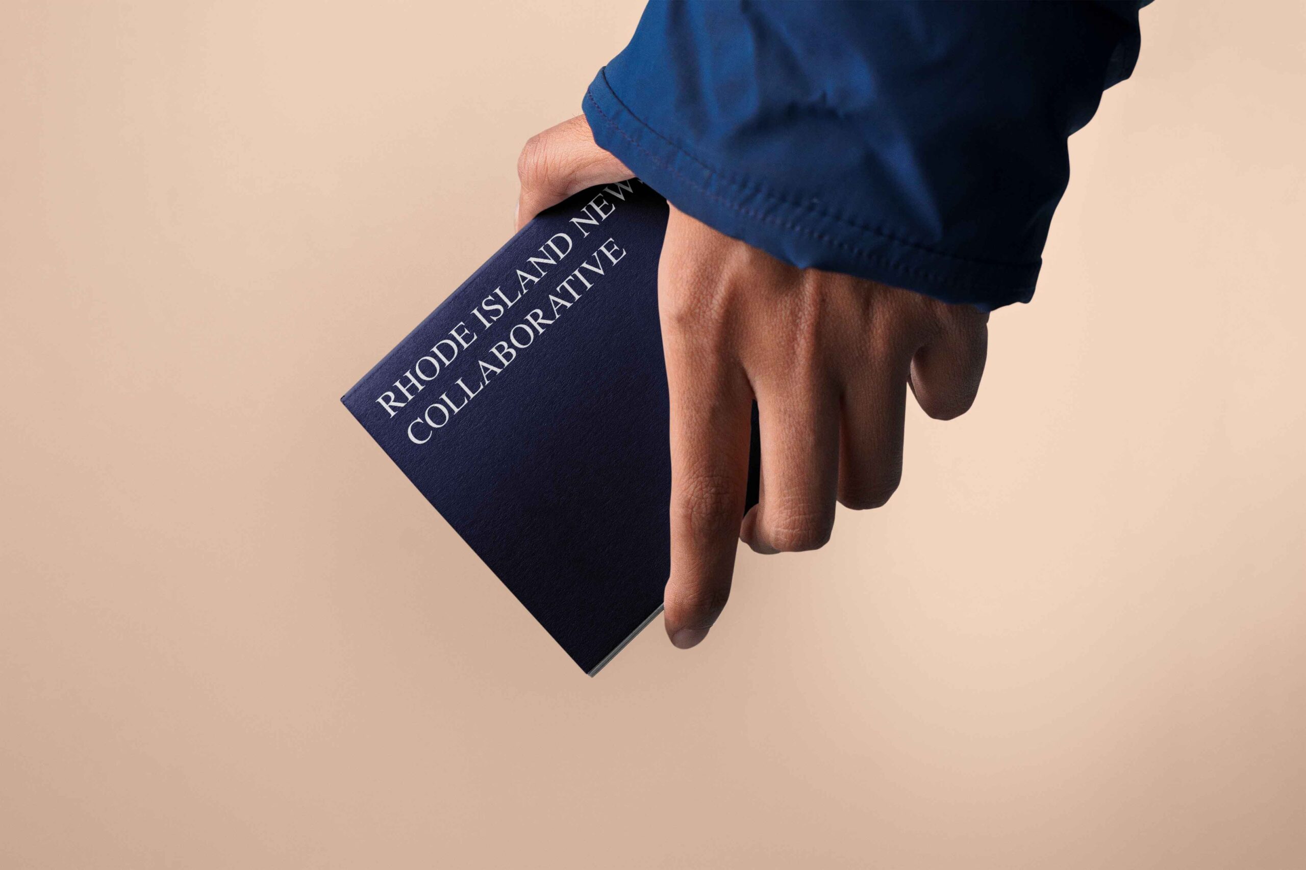
The design is intentionally minimal, allowing it to scale easily and work across multiple applications, from digital platforms to printed materials.


Conclusion
This logo redesign brings clarity and purpose to the Rhode Island New Collaborative’s visual identity. It balances geography with meaning, and simplicity with symbolism. Most importantly, it gives the organization a modern, adaptable mark that reflects who they are: rooted in Rhode Island, and built on connection.